The Pilot Capless Annual Limited Editions
2006–2026 | A design story in 21 editions
By Filip Labanc · 20 min read · stories
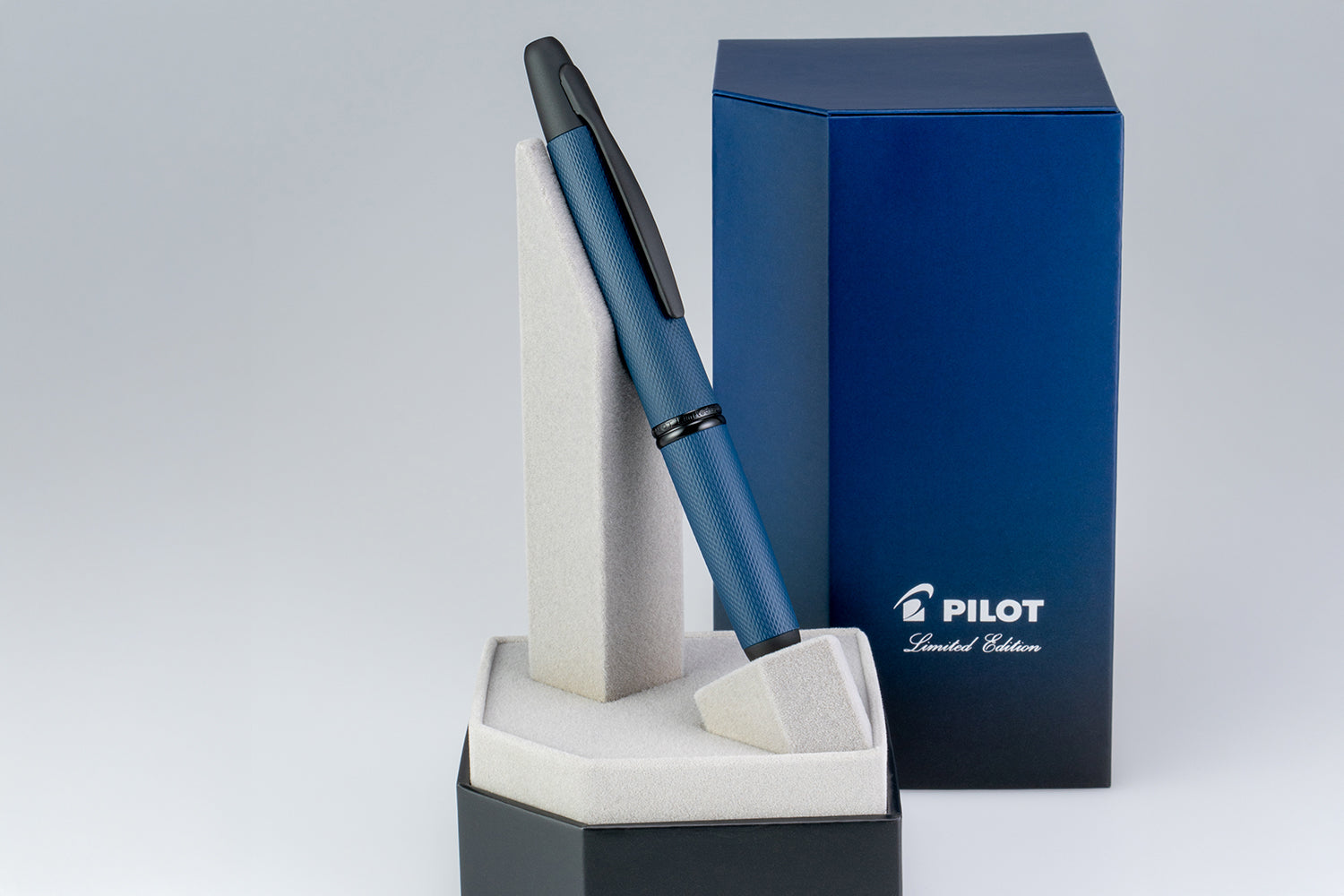
There is something fascinating about a design that never needs to be reinvented. The Pilot Capless, known in North America as the Vanishing Point, has been putting a fountain pen nib at the end of a push-button mechanism since the 1960s. The basic idea has endured because it solves a genuine everyday problem: writing with a fountain pen without having to remove a cap.
The annual limited editions tell a different story. They do not primarily change what the pen does. Instead, they change how it feels, how it catches the light and what it brings to mind. A single colour may lend it confidence or calm. A pattern can make the barrel feel architectural. A gradient can transform an ordinary metal surface into a moment in the landscape.
Here is the visual journey through the modern annual collection, from Ice Blue in 2006 to Golden Journey in 2026, together with two influential earlier finishes. Each has its own character, even though the underlying writing experience remains unmistakably Capless.
Before the annual collection
Two early special finishes helped establish the Capless as more than a highly functional writing instrument. They gave a familiar mechanism a stronger visual identity and foreshadowed the annual releases that would follow.
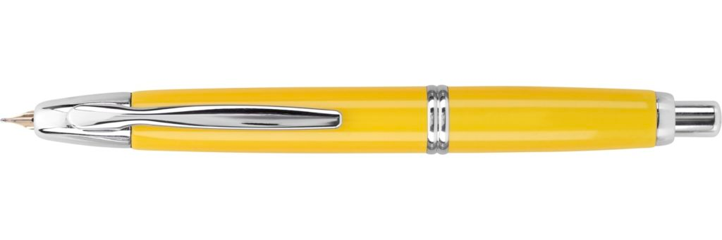
2004 | Mandarin Yellow
Mandarin Yellow makes no attempt to disappear into a desk drawer. The saturated yellow body, edged with polished silver-coloured fittings, has a cheerful directness that still feels refreshing today. It is a finish that places colour above ornament: the unmistakable Capless silhouette does all the structural work while the bright lacquer supplies the personality.
As one of the early limited finishes associated with the North American market, Mandarin showed that the retractable fountain pen could also become a canvas for individual taste. Its importance lies not in a new mechanism, but in its confidence that a useful, familiar object can make an emotional impression through colour alone.
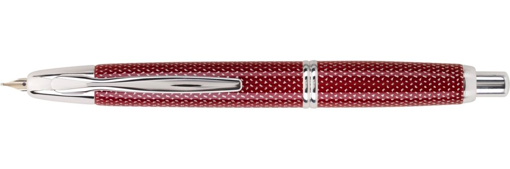
2005 | Red Carbonesque
Red Carbonesque takes a different route to individuality. Rather than relying on an uninterrupted expanse of lacquer, the barrel carries a tightly woven, carbon-fibre-like pattern. The dark red and fine grid of highlights create visual movement, as though the surface had a layer beneath the colour.
The result sits between sport and refinement. It looks more technical than a plain red pen, yet the classic metal clip and fittings preserve the elegance of the Capless form. That combination of texture and practicality would become increasingly important in the limited editions of later years.
The Annual Editions :2006–2026
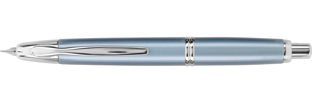
2006 | Ice Blue
The modern annual sequence opens with restraint. Ice Blue is pale, metallic and deliberately cool. Its soft blue-grey sheen is quiet rather than decorative, and it works particularly well beside the bright rhodium-coloured clip and rings. There is a crisp, almost wintry clarity to the finish.
What makes Ice Blue compelling is precisely how little it needs. The smooth barrel has no elaborate engraving or colour transition. It demonstrates how a carefully chosen tone can give a familiar object a new identity, setting the mood for a series that would explore the same idea in very different ways.
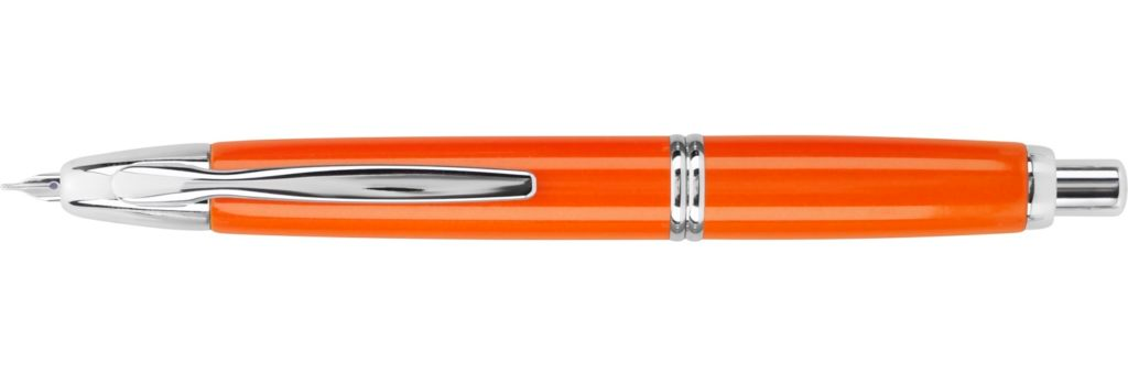
2007 | Orange
If Ice Blue is composed, Orange is unapologetically energetic. The intense, sunlit lacquer brings warmth to a shape usually associated with practicality and restraint. The silver-coloured fittings create a sharp contrast, so the bright body seems even more vivid.
The design is almost an exercise in simplicity: no gradients, no elaborate surface texture, just one assertive colour applied to an exceptionally recognisable silhouette. It gives the Capless a playful character without making the pen itself any less serious as a writing instrument.
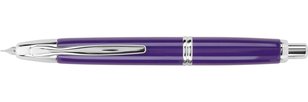
2008 | Purple
The 2008 Purple edition introduces a more jewel-like mood. Its deep violet finish has the richness of saturated pigment, yet the smooth reflective surface remains clean and uncluttered. Against the polished metal details, the colour becomes the centre of attention.
Purple brings a sense of individuality without resorting to theatrical ornament. Where Orange feels lively and extroverted, this edition feels a little more contemplative. It is proof that even a single colour can communicate a surprisingly different personality through depth, tone and light.
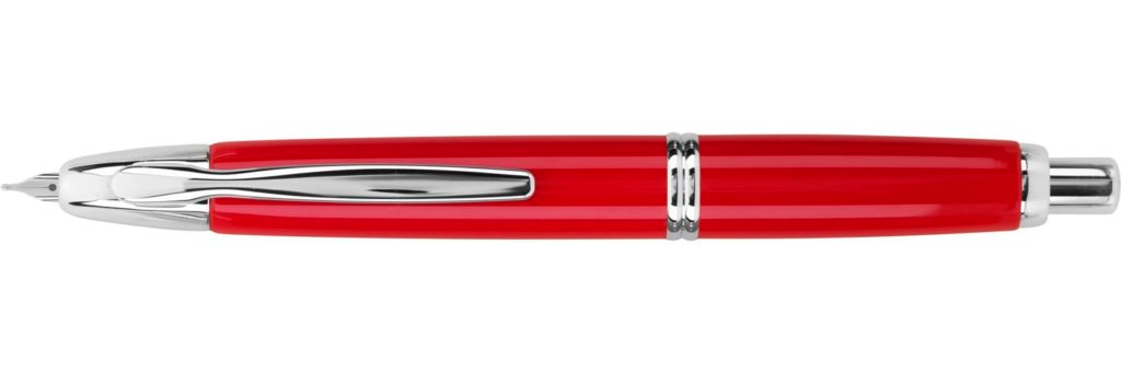
2009 | Vivid Red
Vivid Red is all about immediacy. The glossy red body has a strong visual presence, but the finish avoids the woven surface of the earlier Red Carbonesque. Its impact comes from the purity of the colour, uninterrupted across the familiar curves of the barrel.
Red naturally suggests intensity and confidence, and the 2009 edition embraces both qualities. Paired with silver-coloured fittings, it looks bright and almost graphic. Among the early annual releases, it is a particularly clear example of how Pilot could create a distinct identity without modifying the pen’s fundamental design.
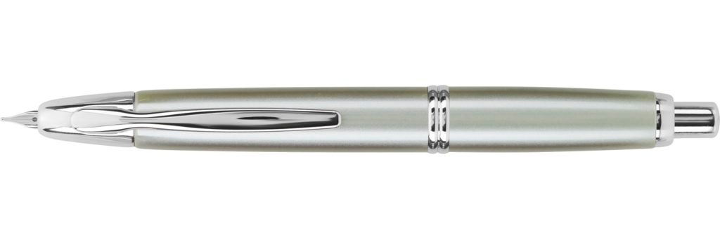
2010 | Ice Green
Ice Green returns the collection to quieter territory. The silvery green has a muted, slightly frosted quality that shifts according to the light. It is subtle enough to seem almost neutral at first glance, yet different enough from ordinary silver or grey to remain memorable.
Set beside Ice Blue, it reveals how the temperature of a colour affects the atmosphere of an object. Both finishes are understated, but Ice Green feels softer and more organic. Its appeal lies in that delicate balance between a familiar everyday pen and a colour chosen with unusual precision.
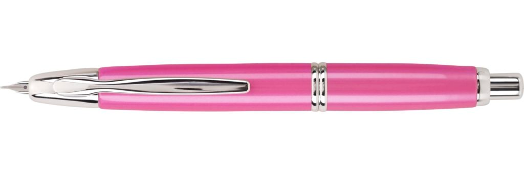
2011 | Pink / Pearl Pink
The 2011 edition gives the Capless an unexpectedly luminous character. Its pink finish catches the light with a soft, pearlescent impression, while the polished silver-coloured parts keep the overall design precise rather than decorative.
The contrast is what makes this pen interesting. A mechanism designed for efficiency is wrapped in a gentle and expressive colour. Instead of looking purely functional, the Capless becomes personal, almost playful. It is one of the releases that best demonstrates the freedom of the annual format: the same architecture can accommodate very different visual moods.
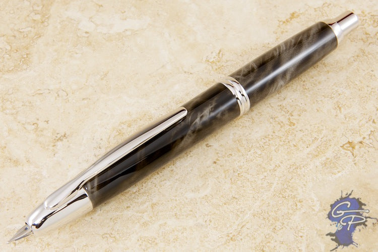
2012 | Charcoal Marble
Charcoal Marble changes the language of the series. Instead of a single lacquer colour, it uses irregular, smoky movements of grey and black. The marbling creates depth and variation, so the barrel seems to change as it turns in the hand.
There is an almost geological quality to the finish, as though the surface had been cut from dark stone. It gives the highly engineered Capless mechanism a less predictable visual identity. The effect is sophisticated rather than loud, and it marks an important shift from pure colour towards a more expressive treatment of the material’s surface.
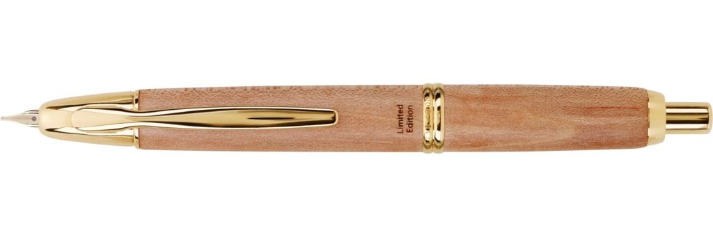
2013 | Maple Wood — 50th Anniversary
For the fiftieth anniversary of the original Capless, Pilot stepped away from the familiar lacquered body and chose maple wood. The grain introduces warmth and an organic quality that conventional finishes cannot quite reproduce. Gold-coloured fittings reinforce the sense of a commemorative object without overwhelming the material.
Wood changes the relationship between a pen and the hand. It suggests something living, tactile and individual, rather than a perfectly uniform industrial surface. In a collection built around an ingenious mechanical design, the Maple Wood anniversary edition pays tribute to time through a material that visibly carries its own history.
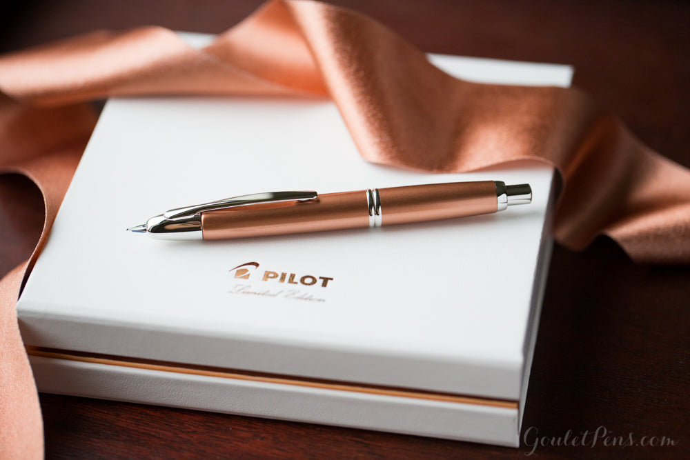
2014 | Copper / Metallic Copper
Metallic Copper returns to a smooth finish, but with a very different temperature. The warm, reflective colour recalls polished metal and the patina of crafted objects. It gives the rounded Capless body a richer and more substantial appearance, even though the iconic shape remains unchanged.
The design stands at an interesting point in the collection. It is more restrained than a dramatic patterned edition, yet more atmospheric than the early plain colours. Depending on the light, the copper tone can feel industrial, elegant or almost autumnal. That versatility is the strength of its identity.
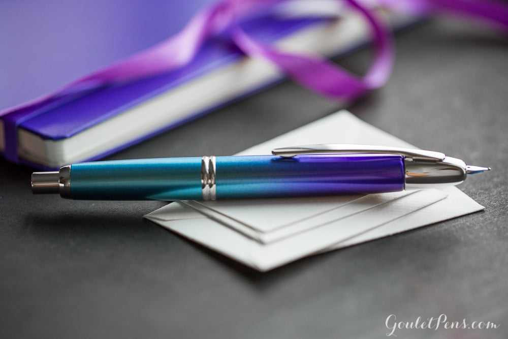
2015 | Twilight / Twilight Blue
Twilight transforms the barrel into a transition between colours. Blue gradually deepens into purple, evoking the short interval when daylight gives way to evening. The effect is subtle enough to feel natural and dramatic enough to be immediately recognisable.
Unlike a plain colour, a gradient gives the pen a sense of direction and passage. The eye moves along the barrel as if following a changing horizon. Twilight is memorable because it suggests a place and a moment without depicting either literally, using only colour to create atmosphere on a familiar metal surface.
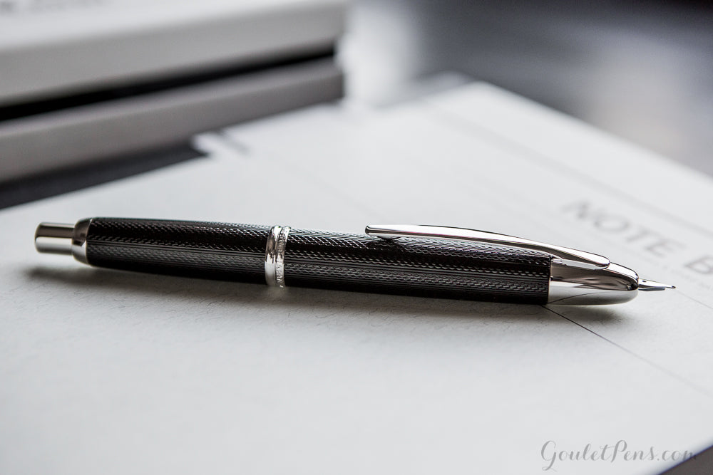
2016 | Guilloché
The 2016 Guilloché edition shifts attention away from colour and towards the discipline of pattern. Its dark surface is covered in closely repeated geometric lines that interact with light and shadow, creating a precise, almost architectural rhythm.
Traditional guilloché ornament has long been associated with fine instruments and decorative metalwork. On the Capless, the effect feels especially appropriate: a pen celebrated for its engineering gains a surface that also expresses control, repetition and technical elegance. It is a quieter release than Twilight, but one that rewards looking closely.
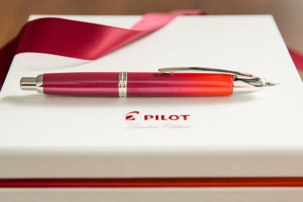
2017 | Crimson Sunrise
Crimson Sunrise builds a landscape out of red. Its colour transitions from deep, shadowed tones to a more luminous crimson, suggesting the changing light of a rising sun. The familiar barrel becomes a small study in warmth, contrast and movement.
Where Twilight imagines the arrival of evening through blues and purples, Crimson Sunrise creates the opposite sensation: energy emerging out of darkness. The two pens share a visual technique, but not an emotional effect. This edition feels more intense and expressive, bringing an atmospheric quality to a mechanical design that remains almost unchanged.
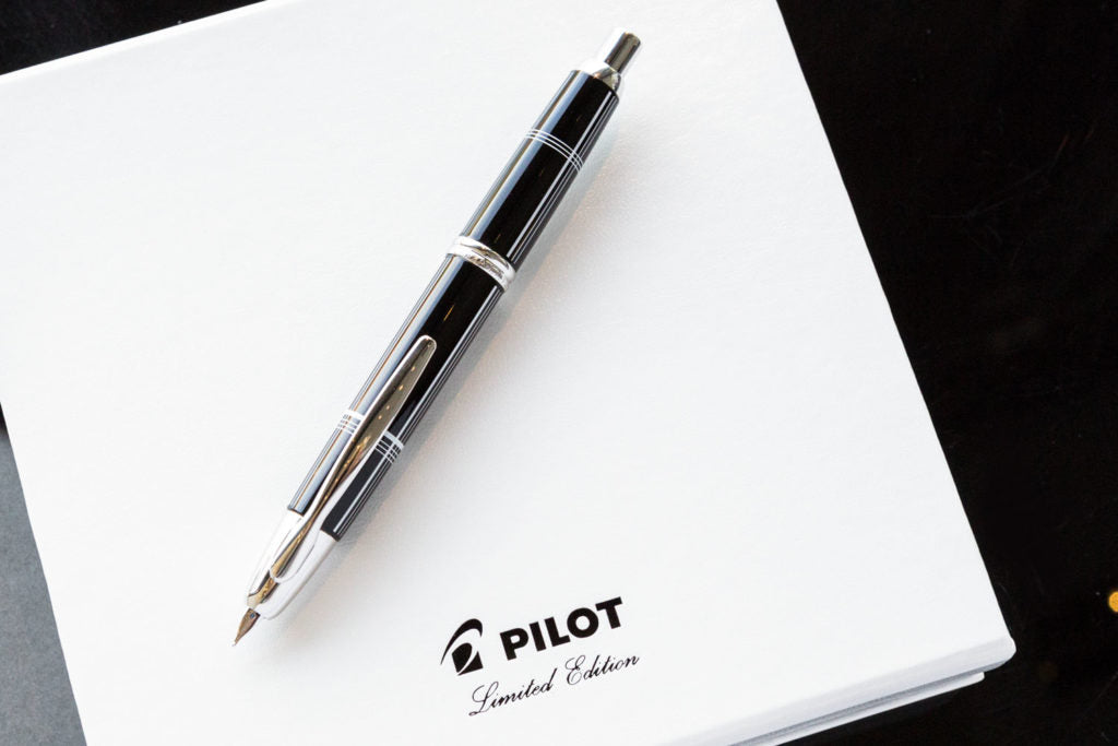
2018 | Crossed Lines
Crossed Lines treats the Capless barrel like a graphic composition. Fine intersecting lines structure the dark surface, producing a repeated pattern that feels disciplined rather than ornamental. It is a design that becomes more interesting as the light catches different parts of the geometry.
The attraction is not an obvious splash of colour but the precision of the decoration. Curved metal and linear pattern work together, creating tension between the flowing shape of the pen and the strict regularity of its surface. It is an especially fitting aesthetic for an instrument whose appeal has always depended on clever engineering.
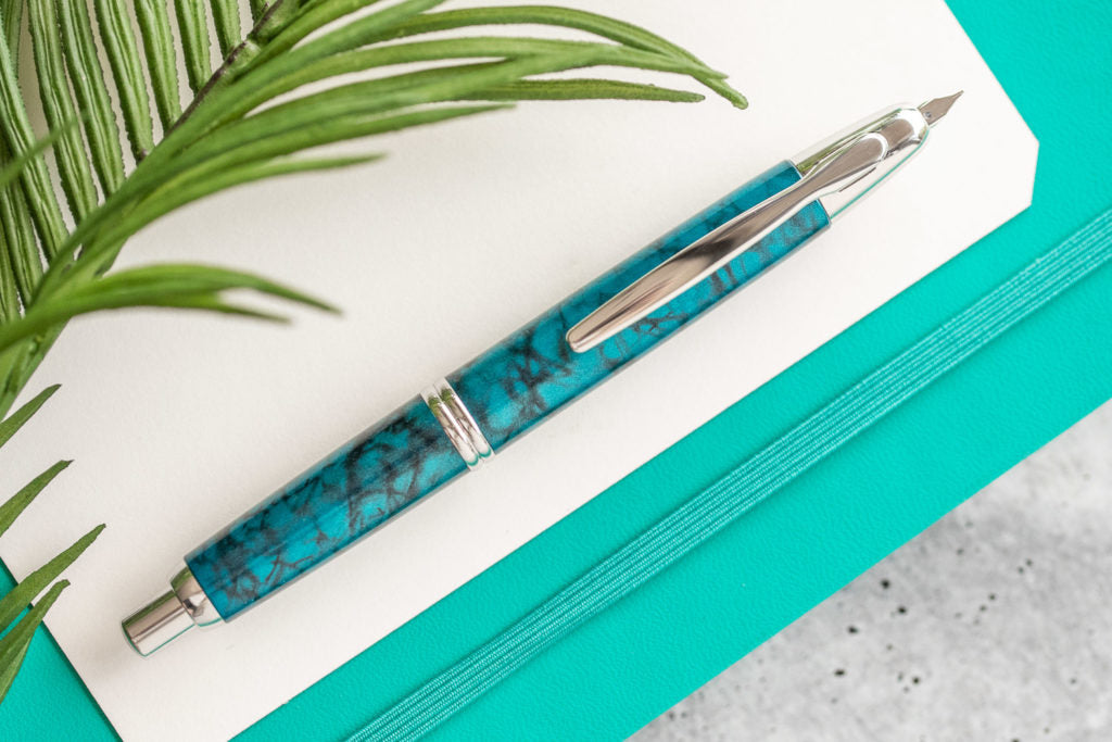
2019 | Tropical Turquoise
Tropical Turquoise introduces movement of a different kind. A vivid blue-green body is interrupted by dark swirling markings, producing an impression of water in motion. The colour recalls tropical seas, while the irregular pattern gives the finish a more organic character than the geometric editions around it.
It is an expressive design that feels lively without losing the elegant proportions of the Capless. The rich turquoise invites a closer look, and the contrasting marks make the barrel more complex than a simple single-colour release. Among the annual editions, it is one of the clearest examples of colour and texture working together.
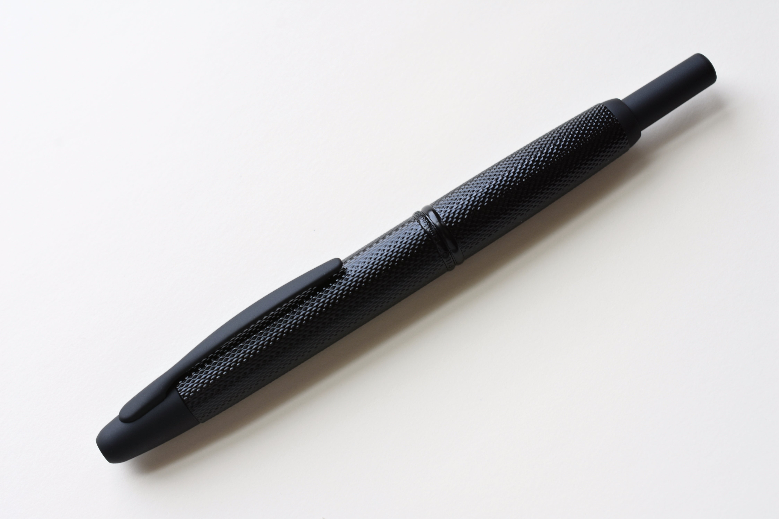
2020 | Link Black
Link Black is deliberately discreet from a distance. Up close, the deep black barrel reveals a tightly organised linked pattern, like woven metal or fine technical mesh. The surface changes as light grazes it, offering more complexity than its restrained colour initially suggests.
The effect suits the Capless particularly well. The pen’s engineering is normally hidden inside an elegant exterior; here, the decoration hints at structure, repetition and connection. Black becomes more than the absence of colour. It becomes a background for texture, giving the edition a quietly sophisticated personality.
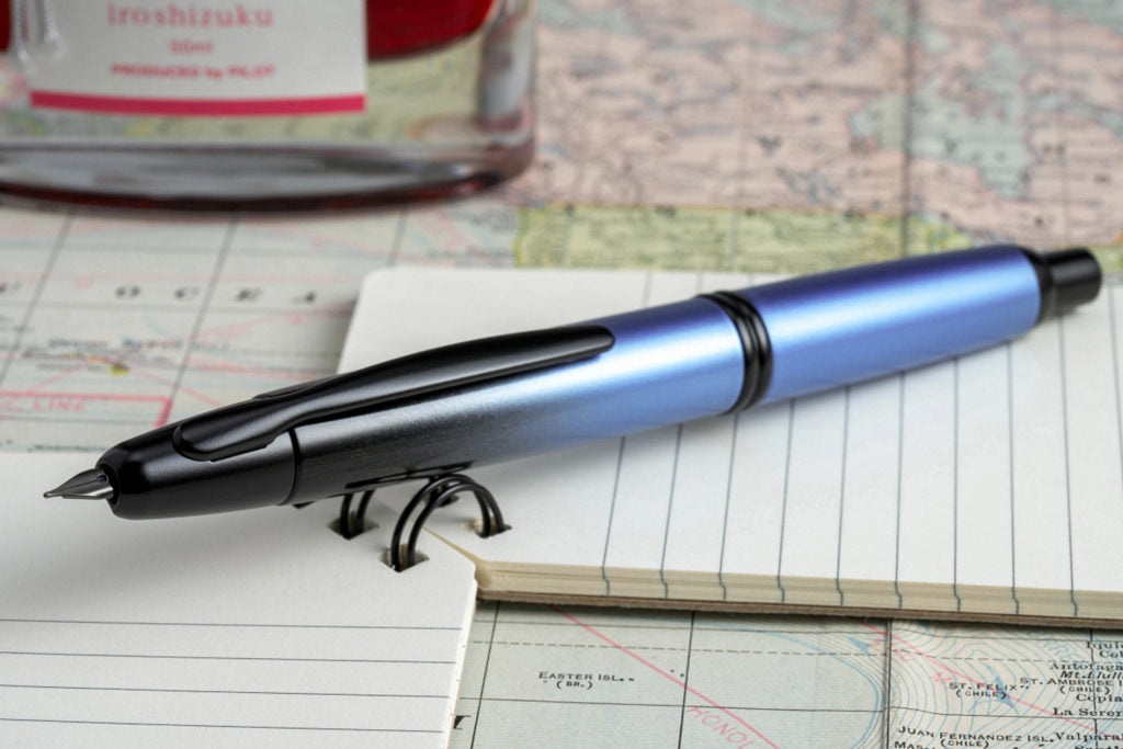
2021 | Black Ice
Black Ice brings the dramatic language of the gradient into a much darker palette. Deep blue gradually dissolves into near-black, and the matching dark details strengthen the impression of a pen emerging from shadow. The result is controlled, modern and intentionally understated.
The name suggests cold surfaces and winter darkness, but the finish is not visually flat. The shifting blue gives it depth and rewards changes in lighting. Compared with the pale Ice Blue that opened the annual sequence, Black Ice feels like a darker counterpart: the same iconic mechanism expressed through a completely different atmosphere.
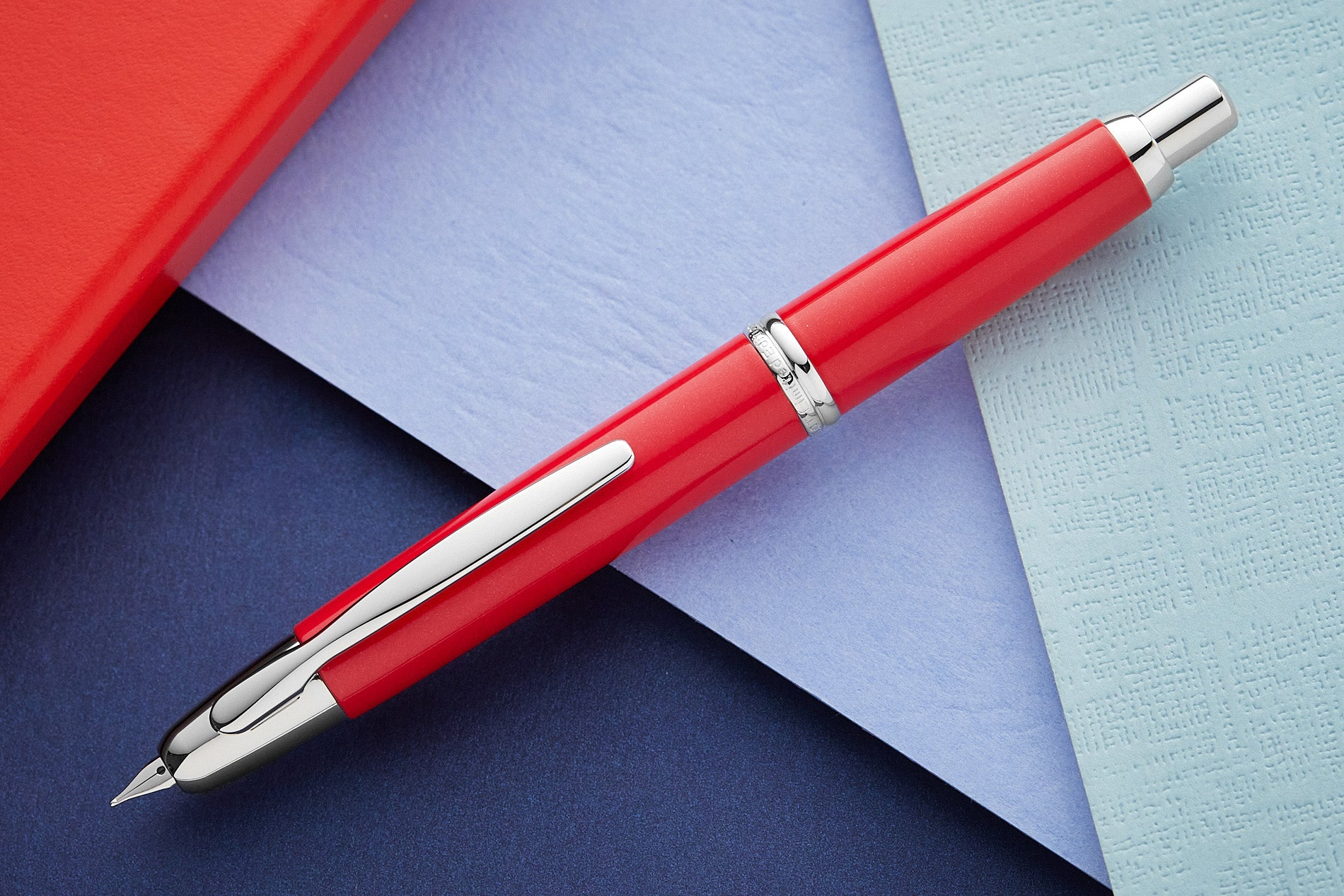
2022 | Red Coral / Coral Red
For 2022, Pilot drew inspiration from red coral and its vivid marine colour. The lacquer has a warm, saturated presence that is distinct from the bright, clean red of Vivid Red or the darker transition of Crimson Sunrise.
Coral carries an association with the natural world, giving the edition a more organic point of reference than a purely graphic colour choice. The finish is bold, yet the elegant silhouette and polished fittings help keep it refined. It is another demonstration of how Pilot can return to a familiar part of the palette without producing the same visual experience twice.
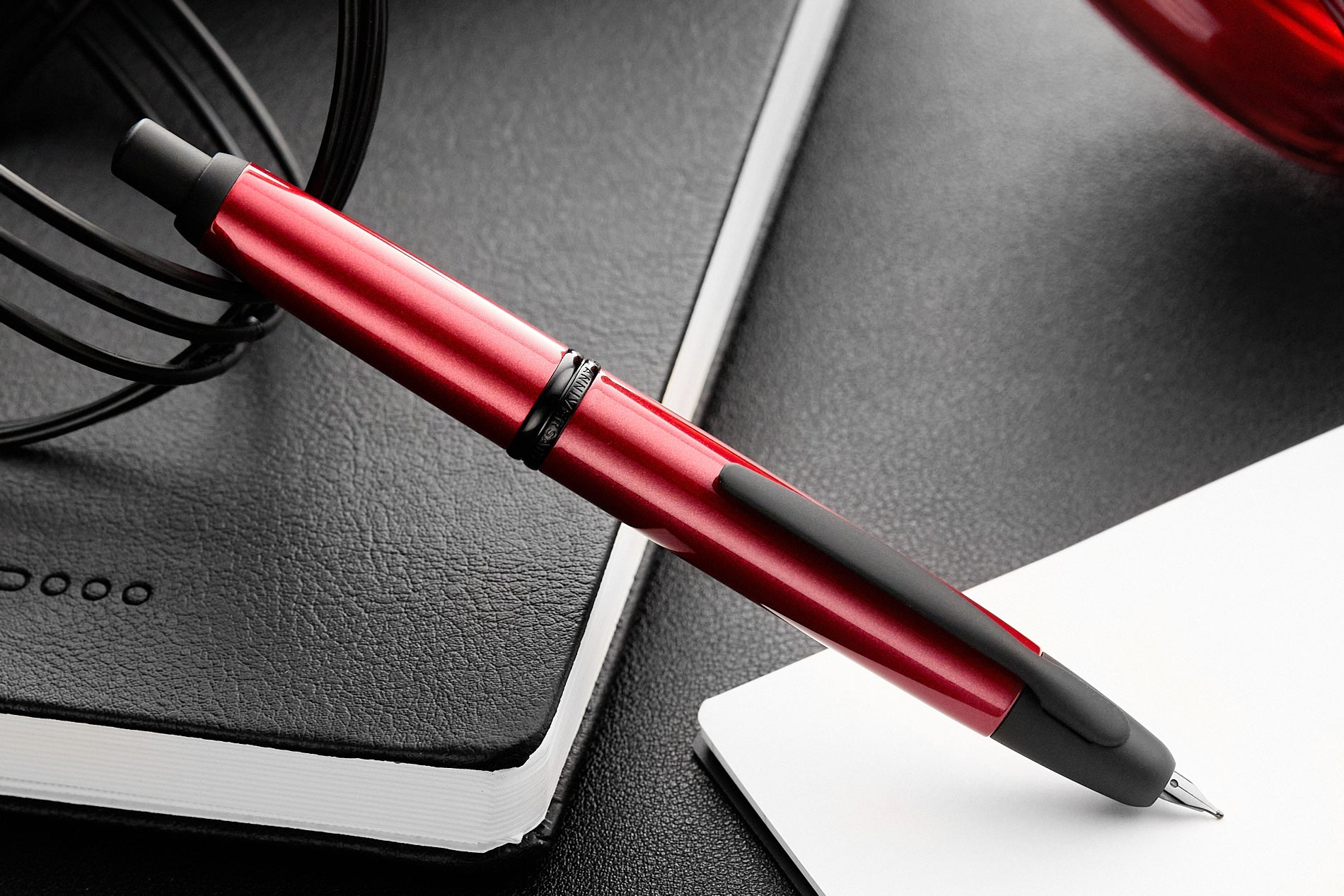
2023 | Kanreki — 60th Anniversary
Kanreki celebrates the sixtieth anniversary of the Capless and draws its meaning from a Japanese tradition marking the completion of a sixty-year calendar cycle. The occasion is associated with renewal and a new beginning, making it a particularly fitting theme for a design that has remained relevant across generations.
The pen expresses this idea through striking red lacquer and contrasting black details. Red is not simply a decorative choice; it carries cultural significance within the kanreki tradition. The result is an anniversary edition with an unmistakable presence, combining the Capless’s enduring functionality with a symbolic reflection on the passage of time.
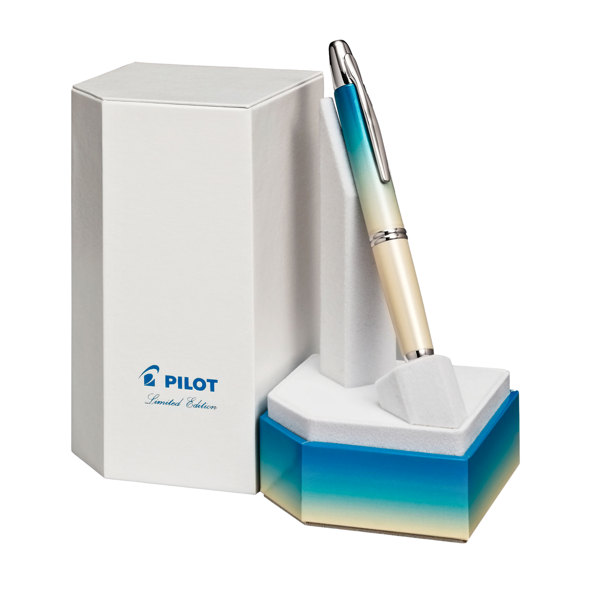
2024 | Seashore
Seashore is a landscape rendered in lacquer. Creamy, sandy tones give way to turquoise and a deeper aquatic blue, as if the eye were travelling from the beach into the sea. The gradient is gentle and luminous, capturing the calm of the coastline rather than the drama of an approaching storm.
The appeal of the design is in its simplicity of feeling. It conjures a place without needing an illustration, using colour alone to suggest sun, water and open space. Among the more atmospheric annual releases, Seashore is one of the most direct expressions of a natural scene.
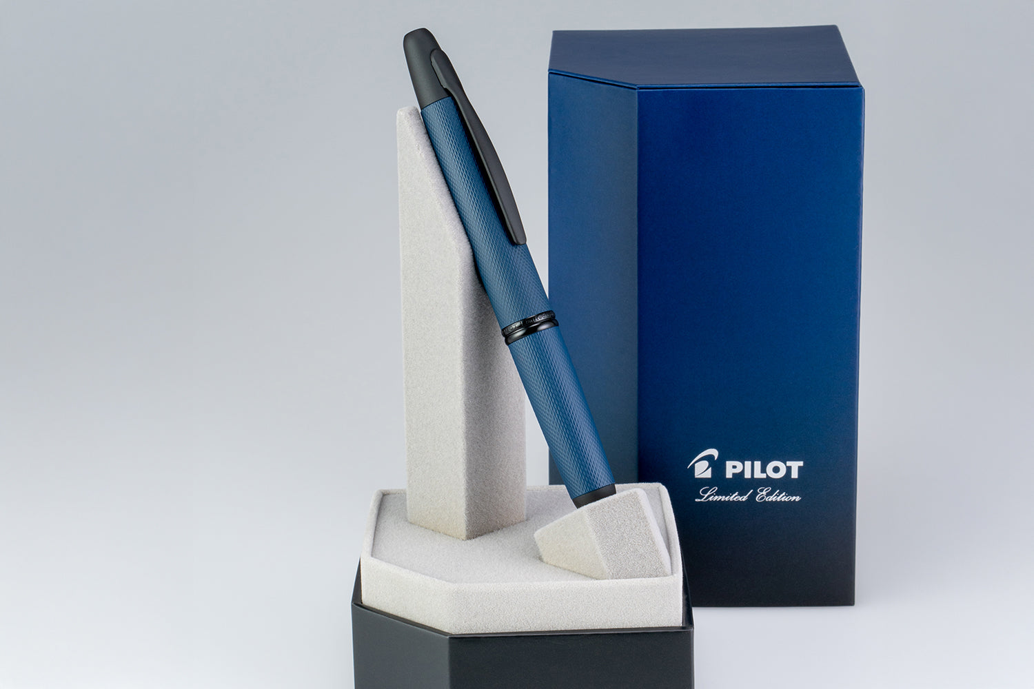
2025 | Link Midnight
Link Midnight returns to the textured, woven-metalwork concept of Link Black, but gives it a deep midnight-blue identity. Subtle patterning plays across the barrel while the dark fittings create a coherent, low-contrast appearance. From a distance it is elegant and restrained; in the hand, the detail becomes more apparent.
The name and finish evoke the quiet depth of late-night hours. This is not a design built around high contrast or a bold illustration. Its personality comes from the interaction between colour, regular texture and light. It presents the Capless as a sophisticated contemporary object rather than a purely decorative collectible.
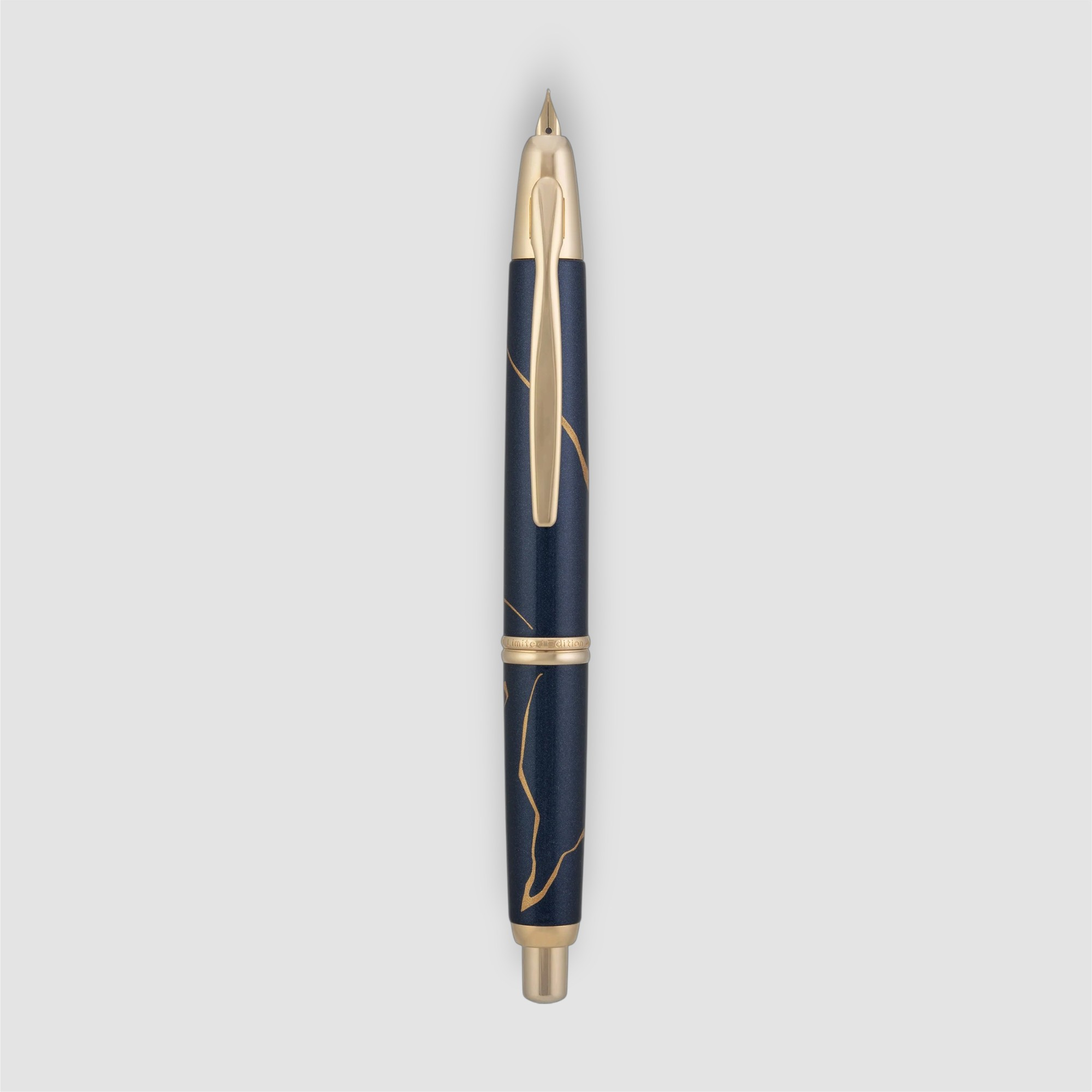
2026 | Golden Journey
Golden Journey takes inspiration from kintsugi, the Japanese art of repairing broken ceramics with gold so that a fracture becomes part of the object’s story. Fine gold-coloured lines travel across a luminous pearlescent blue barrel, giving the design an almost hand-drawn sense of movement.
The theme is especially meaningful for an anniversary-style annual tradition. Instead of presenting perfection as the absence of marks, the design celebrates transformation, experience and continuity. Each arrangement of golden lines has its own character, while the familiar push-button mechanism and retractable gold nib remain at the centre of the writing experience. The result combines a very practical instrument with a visual story about the beauty of what we carry forward.
A continuing design story
Across these editions, the Capless remains unmistakably itself. The earliest releases show how strongly colour alone can shape a pen’s personality. Later finishes explore wood, marble-like surfaces, precise geometric patterns and gradients that suggest changing light or a coastline. Golden Journey adds another layer: a design in which the decorative lines themselves carry a philosophical meaning.
That consistency is the achievement of the collection. The nib still appears with the same simple push of a button, but each year offers a different way to see and enjoy the object. For anyone who writes with a Capless, the question is not merely which edition is the rarest. It is which one expresses something that feels personal.
Which is your favourite? Add it to the comments below